Soundtrap
An online music creation tool and music community. A part of Spotify AB.
Final school project/Berghs
Team member 1/3, UX/UI
Project Timeline: 2 weeks
Challenges: Short time span, no budget, limited access to company data.
Brief
A great part of any creative work is the initial step of collecting and sharing inspiration and ideas. As designers we often use tools such as Pinterest to collect visual ideas. Think of something similar but for collecting sound clips and music. The user should be allowed to add content to this board from a whole range of different sources. Think of all possible scenarios where a user would want to save a sound"
The main point of the brief/ was to initiate to share inspiration with other users to trigger music collaborations.
MVP – the profile page
We decided to focus on the first page a logged in user see - the profile page. Here the user could navigate around Soundtrap, see profile information and have an overview on projects.
Research and Heuristic evaluation/ After doing research and benchmarking on similar services globally (and especially focusing on onboarding and profile pages), we did and heuristic evaluation of the site. Quite soon we discovered painpoints in the interface. Since Soundtrap is a tool in a creative process for mainly beginners, it needs to be easy to navigate, search and find. If we were going to triggers more users to collaborate with each other and to share music, we had to make sure it's easy to do so in addition to the new feature.

-
Duration
During each task we secretly timed the user to see how long it took. It overall took a long time to understand the interface.
-

Users
Seven out of seven thought it was difficult to navigate.
-

Attempted clicks
To change the profile picture the users tried to click on 5 different places. It wasn't obvious where to click.
Usability tests
We tested the current site on seven general users. We gave them easy tasks such as "find another user that plays drums" and clocked them during the process.
Findings
The test-result gave us a more clear direction: seven out of seven thought it was difficult to perfom the tasks and each task took a vast amount of time.
We needed to make the interface and the navigation easier and with less options to click. Each user had similar expectations on where to click (even though it didn't work). We took that finding in particular with us in the upcoming prototype. An overall insight was that the users got confused by menu options that were simliar to each other.

User surveys
We sent out a questionnaire in Facebook groups for online music-makers to get a hunch if the feature might be interesting for them. We asked about how they gather and save inspiration today and if they share it with others. If yes: how and if no: why?

Result
Over 70 percent were positive on sharing their music, but very few were interested in sharing inspiration or the process. They were in general afraid on getting ripped of or felt that it was private. Many did have a habit on sharing inspiration and collaborate in closed channels online.nt site on seven general users. We gave them easy tasks such as "find another user that plays drums" and clocked them during the process.

In Dept Interviews with Soundtraps users
After creating a prototype and preparing questions based on previous tests we interviewed three members of Soundtrap. The purpose was to gain a deeper understanding of their work process, gathering of inspiration, sharing preferences as well as more specific questions with regards to the Soundtrap service and our suggested changes.
The prototype (of the logged in state) had improved searchfields and a new navigation menu (see image above). We studied where they clicked and gave them similar tasks as in the very first test.
Main findings
• Positive outcome of new navigation. Filter options needed improvement.
• Information such as: which of my tracks are the most played/liked, how many followers and how many projects have been made should be visibly towards others users. It was descirbes as engaging and triggering.
• It must be made easier to get in touch to another member. The users wanted to see right away if the person was open for collaboration requests without sending a PM.
• A way to gather inspiration like sound clips for personal use where of interest and was seen as a help in the process. But the will of sharing it more in public was not interesting. Perhaps in a closed group of for example band members.

Hypothesis (Revised)
By adding engaging personal statistics to the user profile, simplifying menus and introducing a memo service, we will trigger interaction and encourage connections between users as well as a behaviour to use Soundtrap as the natural platform for a creative process from start to finish.
We will know if this is true when the number of collaborations have increased by 10 % within six months of release.
New Hypothesis
The findings from our research and tests showed such a clear change from our initial hypothesis, that we made a revised edition of the hypothesis based on the data that we’ve gathered. The focus was still to engage to more collaborations in the community, and to collect inspiration was still a part of the project. The "memo-service" is inspired by the first idea but let's the user upload and save personal inspiration on their profile in addition to projects. A button was added espescially for this in the interface. The main change is the importance of personal statistics, this was single-handedly the most important difference for the users. Also improved search/filter options and an "open for colab" setting that was visible to other users got a very good result in the test.
Hypothesis (Revised)
"By adding engaging personal statistics to the user profile, simplifying menus and introducing a memo service, we will trigger interaction and encourage connections between users as well as a behaviour to use Soundtrap as the natural platform for a creative process from start to finish.
We will know if this is true when the number of collaborations have increased by 10 % within six months of release."

Prototype
All the feautures are visual outputs of the data we collected from the users, in line with the brand identity.
Major changes
Information about likes, how many tracks that are published, followers and so on were considered to be both encouraging for the user (to make and publish more).
An "open for collaboration" profile setting was added to ease the first step to make contact. It clarified that the user was active and wanted to be contacted.
The Pinterest idea was now turned into "memo-board". A part of the interface where the user could upload soundclips and other inspiration/notes for personal projects and invite other collaborators. Only visible to them. An "Add memo" button was places next to the "enter studio" button.
A live feed of comments were added in the top dashboard
Please have a look here for a clickable prototype of the final result or watch the film above.

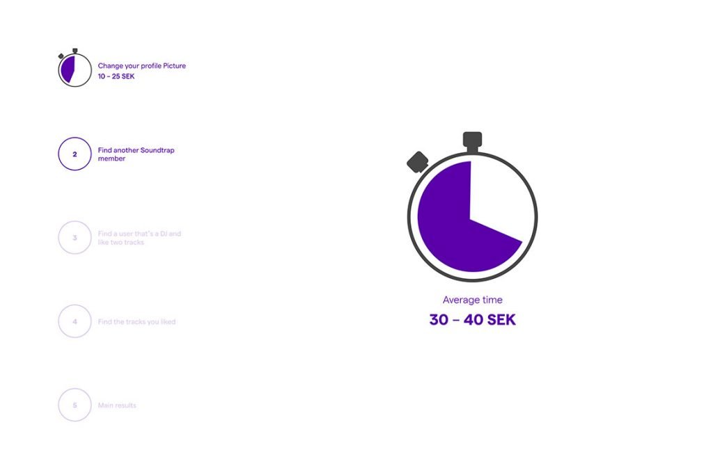
Final usability test - time improvement
Last but not least, we tested the final prototype on seven more random people as earlier to see if the usability was improved. And the result was an easier and faster user experience with no frustration. I think the biggest win was to go from two different search fields to one and add filters. Also to keep the user on the same page while using the menu.