Telia Play
Product Designer
Offline App Experience
Product designer
Team members: IOS and Android developers
Brief
When users for example go on a longer flight, on vacation in the countryside, or spend time in areas that might not have wifi - it’s preferable to have content downloaded.
2 brands to be integrated in the same design system
At this time Telia Play and C More were sharing a lot of source components (with different branding). However, in this case, the offline feature only existed for C More and was very basic plus it didn’t fully follow brand guidelines. A user flow for both brands and an upgraded design were needed.
*Later in the process we learned that C More should be removed completely (Business decision). So the design shifted towards Telias user needs in all markets.
A complete redesign and testing
I had a look at the source design and gathered information. We lacked tracking and data, and I started off with information from customer service and experience within the company to create some first sketches to test with users
In this assignment I:
• Created user flows
• Created components from scratch and tweaked native components/existing components.
• Conducted user testing
• Iterated after findings, and worked closely with developers to stay true to a reasonable timeline and assessment ahead.
Starting up - process
-
Setting structure and scope
I started with organizing and creating a jira, making sure I had understood the assignment correctly, and also had both POs and developers on board with their needs. Customer service also gave valuable insights into user feedback.
I tested the current solution in both Android and IOS (from the different markets) and mapped errors and differences. Since Telia are a huge company, this was a crucial step. -
Technical info to take into consideration:
• IOS and Android differed and needed to be aligned
• Listed all current states and functions, and all logic
• Understand what type of content was legally allowed to download, and how long it could be kept before expiring
• Understand the requirements for all markets (Norway, Sweden, Finland) -
Major redesign of a component
It became clear that a redesign of the list card component also was needed. This component appeared in several other parts of the apps. The component is included here to show the diversity of what is possible with one component.
Although this expanded the scope a bit, it was decided along with the developers that it would save us time in the long run.
Original design
The original design lacked functions and also differed a lot between IOS and Android. To the left are some examples (see colors for references of the same content as different designs).
A part of this case was to acknowledge where we needed to look over if all text, roundings, etc. were connected to the right tokens/components from our design library. And that the same data was displayed (for example Android used the series name on the episodes. And IOS used the episode names, although with a lowercase first letter).
To map things out like this gave me an insight that we needed to work closer together and that there might be mixed/old/other designs out there. Even if this was not the hands-on design process. It was still an important step for me as a designer to realize what needed extra care.
Additional markets
Along the way, it was decided that the Norwegian market which previously had its own design system and features should be included in the design. Norway had slightly different needs due to already established user patterns and country-specific laws. This affected the process in the way that the components needed to be optimized for this. We did not want to clutter the library with more components. Rather enhance and rebuild the ones we did have already.
The Finnish market should also be included with similar needs as Norway. For both markets, the users can record live TV content and after choose to download it.

USER GROUP 1
C More (already users of the current feature in app.
USER GROUP 2
Customers of Telia play (new to the feature). Mobile app users.
Ways of testing
User requirements:
• Test from mobile phone, interact with prototype
• Test was conducted on a distance via Maze.co
• About 50 persons on each test session. Anonymous.
• WoW: Test/iterated/test/etc
I wanted the users to interact with the prototype on their own phones. And I wanted to get feedback on for example how easy/hard it was to perform the task.
How the test was conducted: The user was given a task to perform, then they performed the task in the prototype. After that they got to rank the experience (easy/hard) and could leave a free-text comment.
Key findings
-
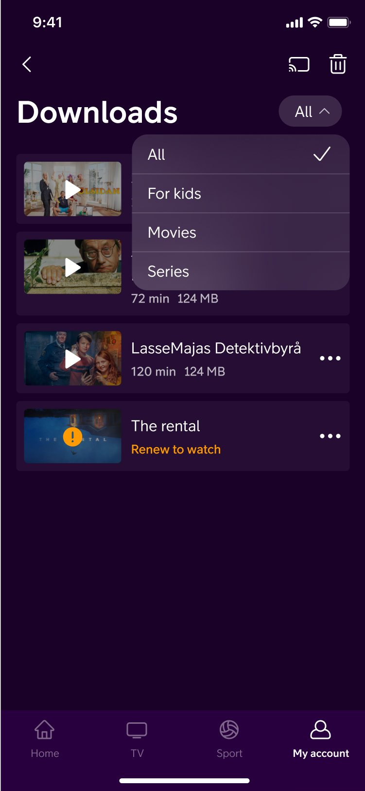
Consistent placement
Remove downloads was set at the bottom of the screen, show only kids content was set at the top of the screen
Decision: To set a consistent place for these two (and perhaps more in the future) functions. To make it easier for the user to both find and interact -

Design for multiple options
The original design lacked options and/or only had hidden options for each download
Decision: Make a bottom sheet menu to make the functions more visible and accessible. And to establish the icon “more” to be used in other parts of the service too. I also introduced swipe and icons (play pause download). -

Groupings for episodes
When the user downloaded several episodes, they showed up in a time-based order (not in episode order 1, 2, 3), and since a series can contain quite a lot of episodes, it resulted in a lot of scrolls.
Decision: Create groupings for episodes -

Snack bars/confirmations
Major actions were lacking confirmation when dhis was tested, evaluated and added along with UX coy.
-

Find more to download
The users currently had to look for content to download themselves. Not all content where downloadable.
Decision: Provide downloable to serve the users needs and to save their time. But also to inspire and display the variety of content. -

Multiple ways to pause or activate downloads
Something the users did frequently was to pause download to save for example data. To make things quicker and option to press image were made. Along with option in bottomheet.

Before redesign
• Mixed design components, unconsistent
• Mixed placements
• Lacking the features that responded to the user needs.
• lack of menus and options
New look and feel
Along with the new functions a new look and feel according to the new branding emerged

Release
The whole experience was released for Telia Play during Q4 2023